Water Droplets - Riverside Botanical Gardens (May 2006)
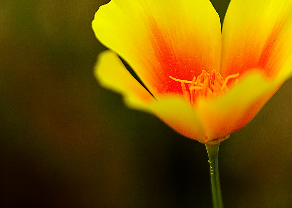
I really like this shot. I think this is one of the few shots I've taken that achieve technical perfection. You're welcome to disagree with me, and I have people telling me that it's a shame the petals aren't all in focus here. The reason they're not is to draw attention to the stamens and the water droplets on the stem. What do you think?
Concocted By An Enlightened Fellow on Monday, May 29, 2006
![]()


4 Comments:
i can't believe no one's posting on this shot. not only is it beautiful, but also the fact that you feel it is representative of your best work. anyway, it does look quite good, and i also think it captures your style.. you use of colors (i'm thinking of the background). i think your best stuff has a very 'earthen' feel. very dark but warm earth-tones contrasted by super highlighted subjects. and relatively small focus points. i like this shot, anyway.
Ok, ljsbreker has pointed out that I really should post. I've been trying to decide what to say, which is what has caused a several day delay. I think it is a fine picture, I like it a lot. To say it's your best is a bit extreme, in my opinion. If in fact the water droplets are what you are wanting to focus on I wonder what cropping it a bit would do? I think right now they get lost behind the vibrant color. But I like how the focus is taking you over the pedal and into the heart of the flower. As always, I enjoy your photography.
I don't believe this is my "best" shot. It's just one of the few that the composition could not be improved upon. Granted, the original file needs to be viewed to completely understand that, because you cannot see the details fully in this small version, or even in the larger compressed jpeg you get when you click on it. However, any crop would completely throw off the balance of the image. The water droplets have been placed in the lower right power point and the stamens and red highlights with tiny perfectly focused pollen particles inside the flower have been placed in the upper right power point. The bright positive spaces on the left have been perfectly balanced out by the darker negative space with orange and green tonal qualities on the right. Granted, not everyone will agree on the aesthetic quality of this shot, but from a technical and compositional standpoint, it is perfect and I don't believe there is a critique it could not stand up to. If it has stood up under one of my own extremely harsh critiques, that says something.
Absolutely WONDERFUL! The colors just glow as nature intended. ; )
Smooch,
The Tart
Pssssssst. Come by my photo bloggy to see your poem in my recent post. *wink*
Post a Comment
<< Home